07
AI Racing
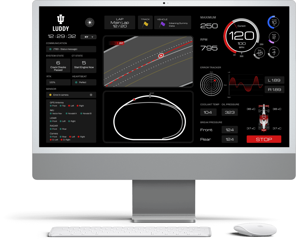
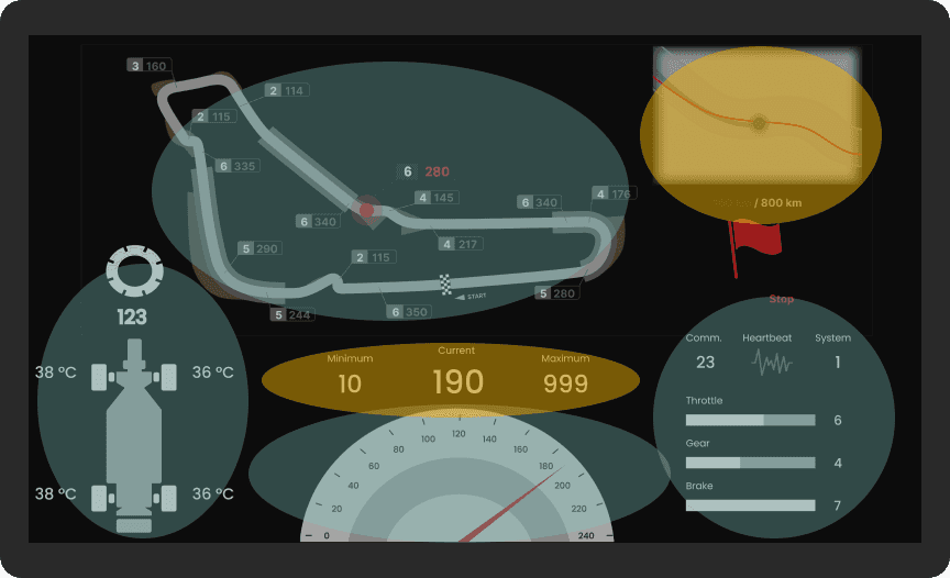
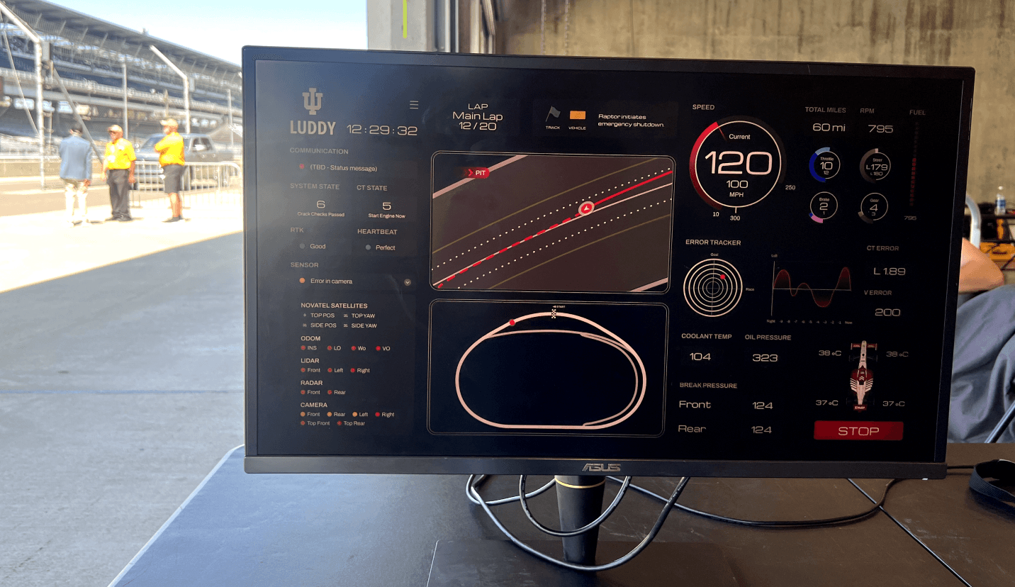
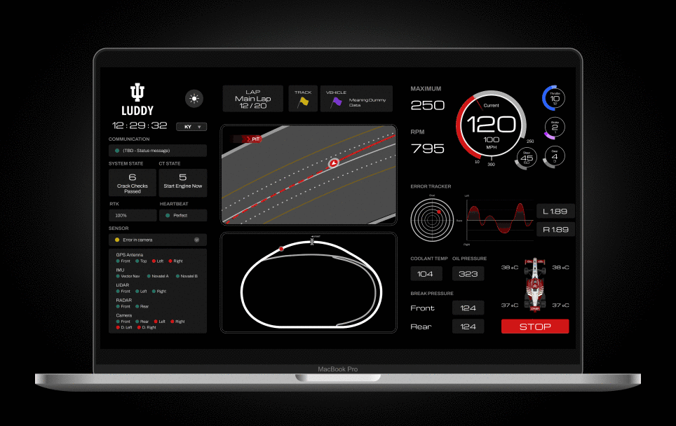
A real-time dashboard for AI racing, enabling engineers to monitor car performance and adjust commands via data visualization and infographics.
Our design tested in simulations and Indy Autonomous Challenge 2024, prioritizes logic, aesthetics, and simplicity.

Timeline
JUN - JUL 2024
Position
UIUX designer
Team
1 Design Lead
1 Designer 🙋♀️
1 Developer
Tool
Figma
React
Overview
A real-time dashboard for AI racing, enabling engineers to monitor car performance and adjust commands via data visualization and infographics.
My contribution
As the designer,
Designed and collaborated to launch the dashboard on a cross-functional team of supervisors, engineers, developers and developers.
Conducted comprehensive stakeholder interviews and simulation testing to improve visualization and information architecture.
Challenge
Information Prioritization
Real-time Usability (User-centric)
Visual Clarity in High Data Density
Solution
Information hierarchy
User-centric intuitive streamline
Visualization principles
Context
The high-stakes competition AI Racing pushes the limits of autonomous technology, showcasing a thrilling future of mobility. Our team VAIL, from Luddy School of IUB, was formed in 2023 and geared up to debut at Indy Auto Challenge 2024.
Our design team started from scratch to develop a racing dashboard for real-time data monitoring.
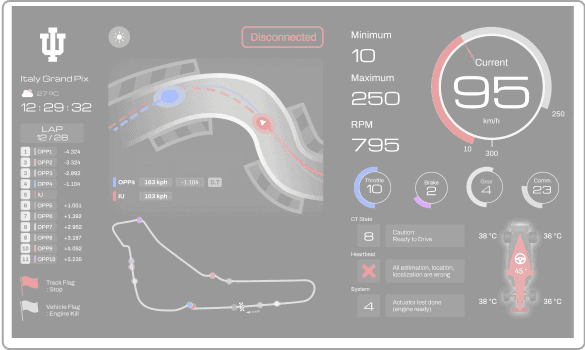
However, the first version dashboard is not satisfying among the cross-function team.
Who are we designing for?
The dashboard would be used by the whole team, including:
the professor
the manager
6 group leaders (different technical background)
team members

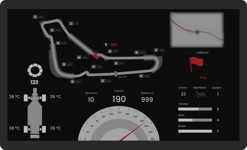
Feedback on the first version
“Information can’t be read immediately from the graph.”
“Some elements are not understood by different members.”
“Some key data, e.g. the map, speed, sensor state, should be highlighted.”
“It looks fancy, but messy.”
Statement
How might we design the dashboard and visualize the data in a more user-friendly way for the whole team?
Problem Breakdown
Complicated data types
Presenting various data types from 18 sensors (e.g. numerical, graphical, text-based) increases complexity in visual representation.
Competition use
The fast-paced competition setting requires quick comprehension and minimal cognitive load for the team under pressure.
High data density
Displaying a large amount of data on a single screen, need to avoid overwhelming users and ensure clarity.
User Differentiation
To accommodate various user roles with different data needs, making it challenging to design a layout that is both customizable and intuitive for all team members.
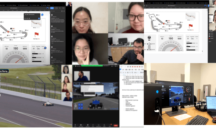
Research Methods
To improve, we conducted extensive research to comprehensively analyze the current design and gather insights to inform the iteration.
Stakeholder Interviews
We conducted 7 interviews with each group leader and the team manager to figure out problems in information hierarchy, especially in:
How they view data?
What's the importance of different data?
Heuristic Evaluation
We held heuristic evaluation meetings in team for usability inspection, and communicated the difficulties in both front-end and back-end development.
User Needs
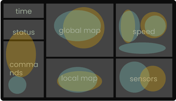
Information hierarchy should be intuitive
The primary (in yellow) and secondary (in green) information was not differentiated. The more important ones need to be highlighted.
Data visualization should be effective
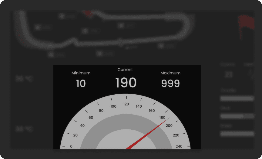
Feedback indicated that some of the data graphs were not understandable. An effective visualization will minimize the reaction time to read, making the dashboard helpful during the competition.
Visual design should be efficient
The current visual design does not aid team members in understanding the information more quickly and accurately.
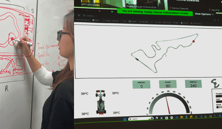
Explore the solutions
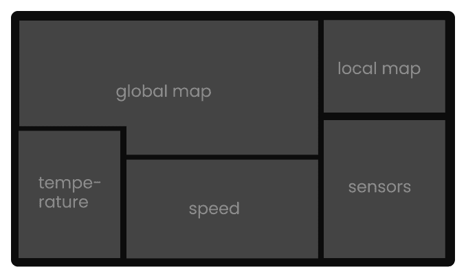
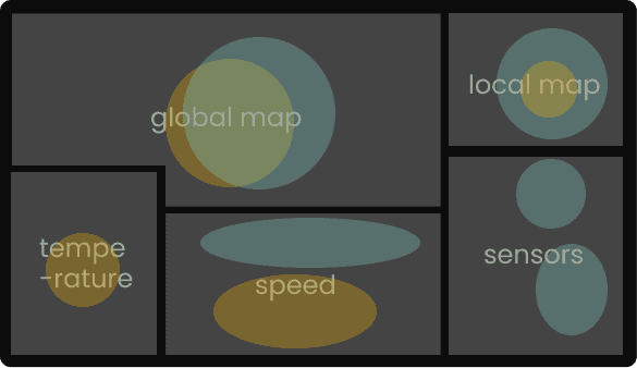
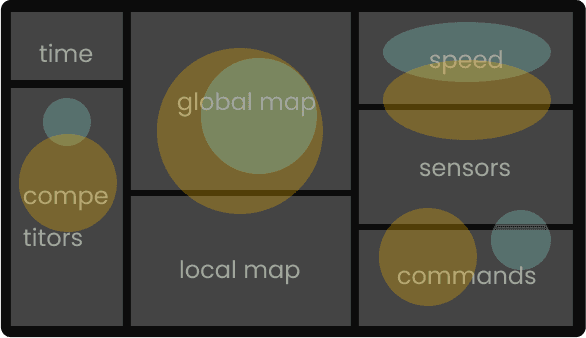
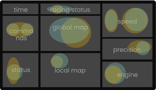
Reorganized information hierarchy
Reorganize the layout based on importance hierarchy and reading gravity in the real racing situation.

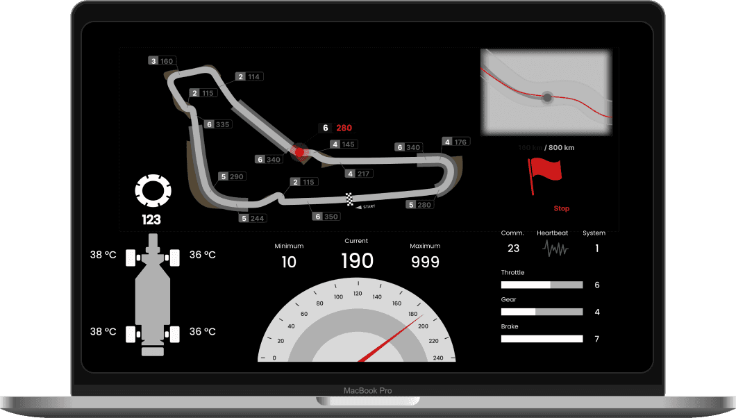
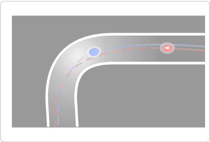
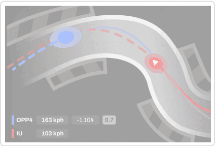
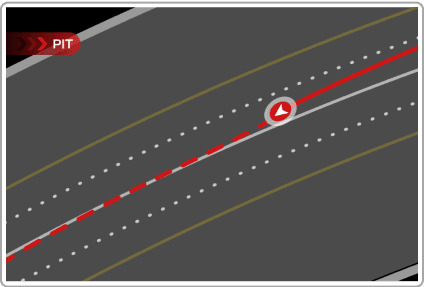
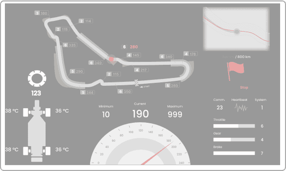
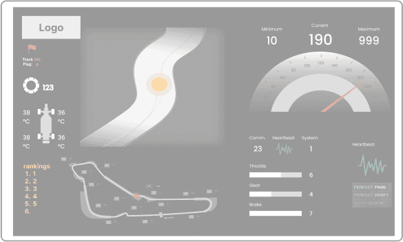
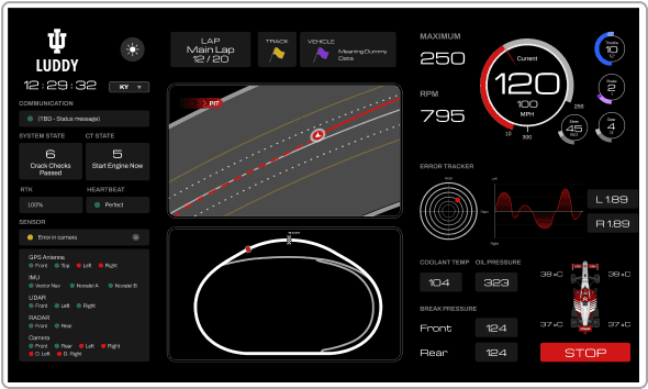
Final Design
Effective Visualization
Applied effective data visualization to various datasets based on feedbacks.
For example, “Local Map”:
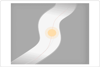
Final Design
User test, dry test & iterations
To test intuitiveness and readability, we conducted two types of user test for each iteration.
Visual Hierarchy
To test how well the design guides attention to key elements, we asked participants what they notice first. Then we compared the perceived importance with the actual importance (what should be noticed).
The larger the color area, the more perceived/actual importance.
actual importance (key information)
perceived importance
Iterations
Based on the third layout, the final design communicates information in a more intuitive way.
Visual Effectiveness
To test the effectiveness of the visual design, we conducted multiple outdoor readability tests, to ensure optimal results in real environment in layout, data visualization, color, and typography.
Final Design
User-Centered Design
The dashboard prioritizes user needs by offering an intuitive interface that helps team members easily navigate complex data and make decisions quickly during the competition.
Clear Data Visualization
We implemented optimized visualizations that reduce cognitive load, allowing for faster and more accurate data interpretation, even in a high-pressure environment.
Reflection
Embrace the new things
Initially, I didn’t fully understand why we were investing so much effort in R&D for the AI racing car. Wasn’t it just a fancy toy for scientists?
However, after engaging in this process for the competition, I realized it’s more than just a competition — it pushes the boundaries of autonomous technology and offers a glimpse into the future of mobility. As a designer, participating in AI racing allowed me to appreciate the collaboration between research and practice, and how innovation is even in cutting-edge technological fields.
Collaboration make things happen
This project allowed me to practice attention to detail and human-centered design thinking to consider all the useful features I could optimize to such a simple tool. I sought opportunities to experiment with developers and engineers and explore best effect under real circumstances. Through collaborations with engineering, I was able to learn how to consider edge cases and understand backend logic.